The 7 basic tools of SPC (quality control) are check sheets, histograms, Pareto charts, cause-and-effect diagrams, scatter diagrams, control charts, and flow charts.
They help collect, analyze, and display process data.
These tools are used to identify problems and improve quality control.
In this article:
7 Tools of SPC (Statistical Process Control)
The 7 tools of SPC (also called the 7 basic quality tools) are simple statistical methods used to analyze, monitor, and improve process quality in manufacturing and services.
They are widely used in SPC, Lean, and Six Sigma to reduce variation and defects.
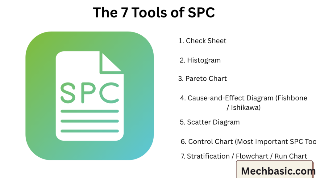
The 7 Tools of SPC
- Check Sheet
- Histogram
- Pareto Chart
- Cause-and-Effect Diagram (Fishbone)
- Scatter Diagram
- Control Chart
- Stratification / Flowchart (sometimes substituted with Run Chart)
1. Check Sheet
Definition
A structured data collection form used to record defects or events in real time.
Purpose
- Collect data easily
- Identify frequency of problems
- Organize raw information
Example
A factory records defects:
| Defect Type | Count |
|---|---|
| Scratch | |
| Crack | |
| Dent |
Applications
- Defect tracking
- Machine failure records
- Quality inspection logs
Advantage
✔ Simple and fast data collection
2. Histogram
Definition
A bar graph showing frequency distribution of data.
Purpose
- Understand variation
- See pattern of process output
- Check process stability
Example
Bolt diameter distribution:
- 9.8 mm → 5 parts
- 10.0 mm → 20 parts
- 10.2 mm → 10 parts
What it shows
- Spread of data
- Center of process
- Shape of distribution
Advantage
✔ Helps visualize variation clearly
3. Pareto Chart
Definition
A bar chart based on the 80/20 rule.
Principle
80% of problems come from 20% of causes
Purpose
- Identify major defect causes
- Prioritize improvement efforts
Example
| Defect | Frequency |
|---|---|
| Scratch | 50 |
| Crack | 20 |
| Dent | 10 |
Scratch is the major issue.
Advantage
✔ Focuses on most important problems first
4. Cause-and-Effect Diagram (Fishbone / Ishikawa)
Definition
A diagram used to find root causes of a problem.
Structure
Looks like a fish skeleton:
Main categories:
- Man (People)
- Machine
- Material
- Method
- Measurement
- Environment
Purpose
- Identify possible causes of defects
- Organize brainstorming
Example
Problem: Poor weld quality
Causes:
- Low skill operator
- Faulty machine
- Poor material quality
- Incorrect welding method
Advantage
✔ Helps find root cause, not just symptoms
5. Scatter Diagram
What it is
A graph showing relationship between two variables.
Purpose
- Find correlation
- Identify cause-effect relationship
Example
- Temperature vs defect rate
- Pressure vs strength
Advantage
✔ Helps understand relationships between variables
6. Control Chart (Most Important SPC Tool)
Definition
A graph used to monitor a process over time.
Structure
- Center Line (average)
- Upper Control Limit (UCL)
- Lower Control Limit (LCL)
Purpose
- Detect process variation
- Identify abnormal conditions
- Maintain stability
Example
Monitoring bolt diameter over time.
Key Idea
- Points within limits → process stable
- Points outside limits → process problem
Advantage
✔ Real-time process monitoring
7. Stratification / Flowchart / Run Chart
Different companies may replace this tool with similar ones.
Stratification
Separates data into groups:
- Operator-wise
- Machine-wise
- Shift-wise
Purpose
- Identify variation sources
- Compare performance
Example
Defects by machine:
- Machine A → 10 defects
- Machine B → 2 defects
Flowchart (Alternative use)
Shows process steps visually.
Run Chart (Alternative use)
Plots data over time without control limits.
Advantage
✔ Helps locate variation sources clearly
Summary Table
| Tool | Purpose |
|---|---|
| Check Sheet | Data collection |
| Histogram | Data distribution |
| Pareto Chart | Identify major problems |
| Fishbone Diagram | Root cause analysis |
| Scatter Diagram | Relationship analysis |
| Control Chart | Process monitoring |
| Stratification / Flowchart | Data grouping / process mapping |
How These Tools Work Together
In real SPC use:
- Collect data → Check Sheet
- Analyze variation → Histogram
- Find major defects → Pareto Chart
- Investigate causes → Fishbone Diagram
- Check relationships → Scatter Diagram
- Monitor process → Control Chart
- Group data → Stratification
Real Industrial Example
Problem: High rejection rate in bolts
Step 1: Check Sheet
Record defect types
Step 2: Pareto Chart
Find major defect = “diameter variation”
Step 3: Fishbone Diagram
Possible causes:
- Machine wear
- Tool misalignment
- Material variation
Step 4: Control Chart
Monitor diameter over time
Step 5: Stratification
Check if one machine causes more defects
Result:
✔ Root cause identified
✔ Process improved
✔ Defects reduced
Why These Tools Are Important
- Simple to use
- No advanced mathematics needed
- Effective in real manufacturing
- Foundation of Six Sigma and Lean
Conclusion
The 7 tools of SPC are basic but powerful quality control tools used to analyze data, identify problems, and improve processes. They include check sheets, histograms, Pareto charts, fishbone diagrams, scatter diagrams, control charts, and stratification/flowcharts. Together, they help organizations reduce defects, understand variation, and maintain stable, high-quality production processes.
Other courses: